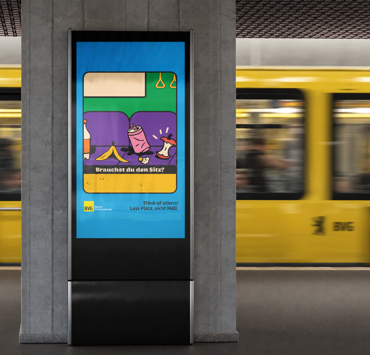
This poster series began the way most urban ideas do, by paying attention. After years of riding across Berlin, I kept noticing the same small frictions: knees sprawling into two seats, backpacks and umbrellas bumping faces, trash left behind, people forcing their way in before others can exit, luggage blocking the escalator flow. Small acts with a big impact on shared space.
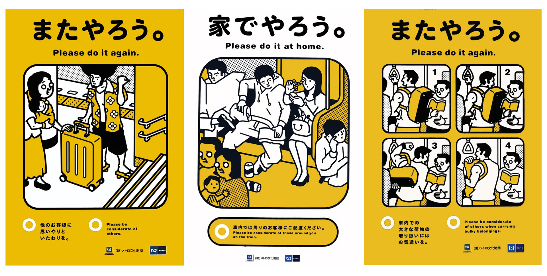
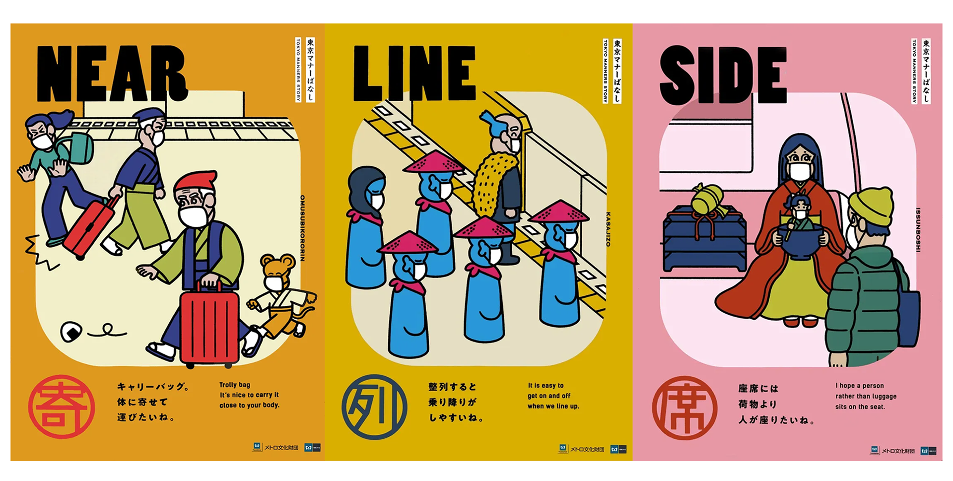
I wanted a response that was not scolding or preachy. Design can set the tone of a city. If the expected behavior is visible, simple, and a bit witty, people correct themselves without feeling shamed. Posters are low effort, repeatable across lines, and easy to pair with stickers or short digital loops, which is how a shared visual language for courtesy actually spreads. The starting point was Thomas Gittel’s archive of Tokyo Metro etiquette campaigns, where a monthly, behavior-specific poster nudges one small action at a time, using clear visuals and humor rather than instruction. That logic translates well to Berlin: same clarity and wit, but with BVG’s own voice and local scenarios.
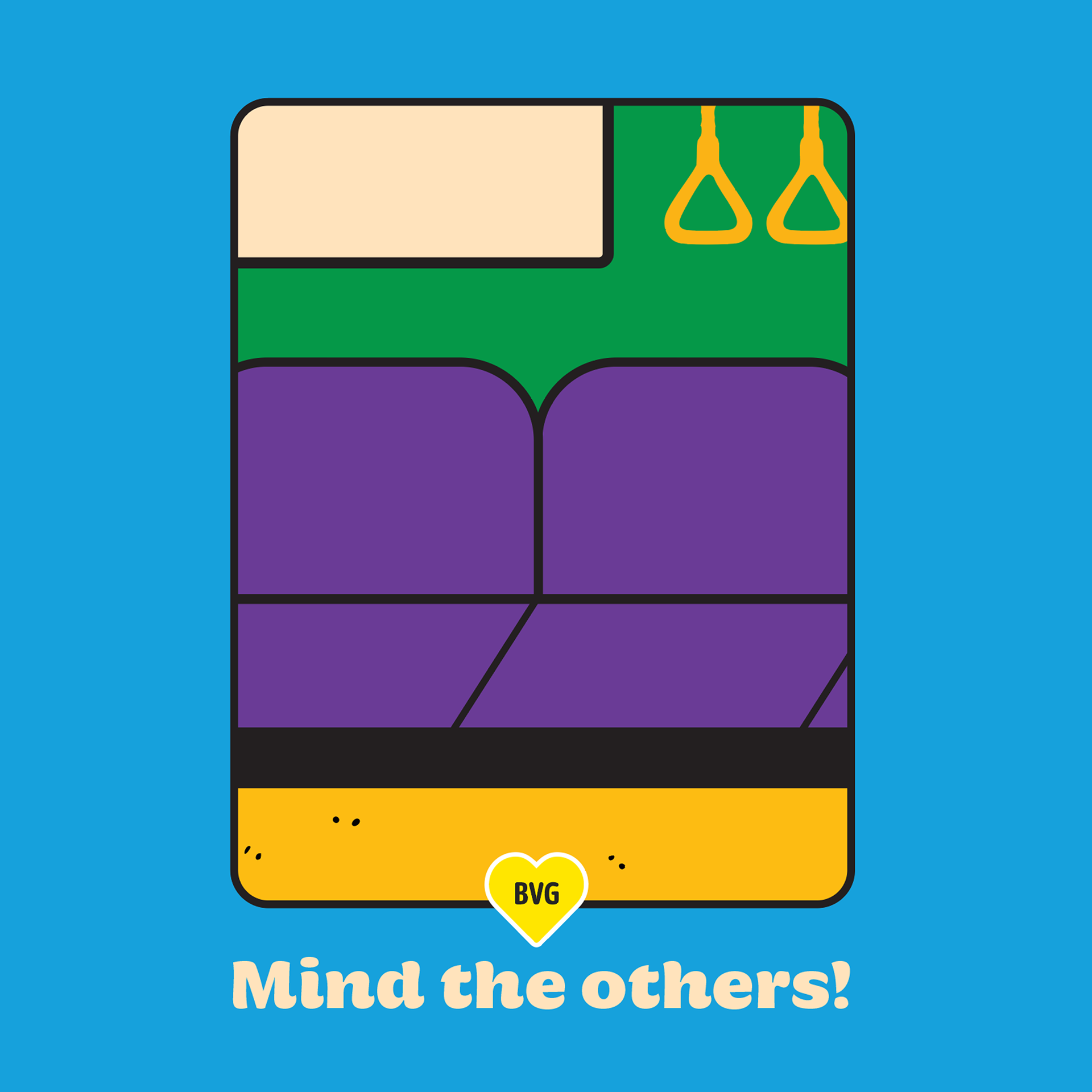
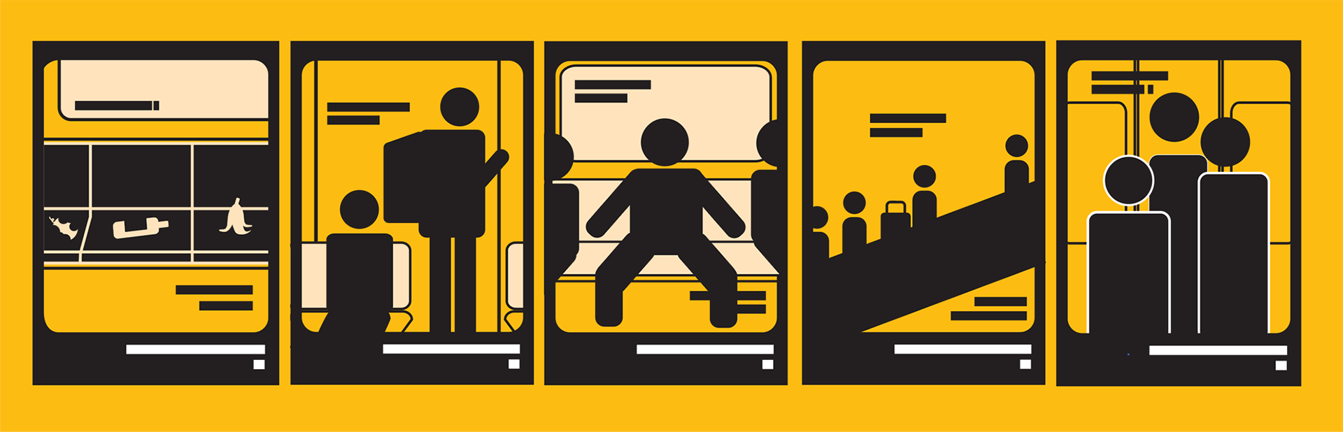
Each scene started as a simple pictogram to lock the composition before color. Bold silhouettes made it easy to judge density, negative space, and rhythm at a glance. Seats, doors, and escalators became modular elements, while people and props stayed minimal and expressive only where direction mattered.
Grayscale tested how each poster works without the distraction of color. Light, mid, and dark tones alone showed depth, spacing, and whether the main action stood out at a glance. This phase was about simplifying the busy areas and reserving the strongest contrast for the focus.

The final palette mixes saturated primaries with playful accents, bold enough to catch attention inside a busy train while staying friendly rather than aggressive. It also reflects BVG’s broader color usage beyond yellow, with green, pink, blue, purple, and orange.

Hegante Display Bold carries the tone of voice. Its rounded, chunky forms feel friendly and work for short, witty headlines that need to catch the eye fast. Enra Sans Variable Semibold is the functional counterpart, clean and legible from a distance, and close to BVG’s own sans-serif signage tradition.

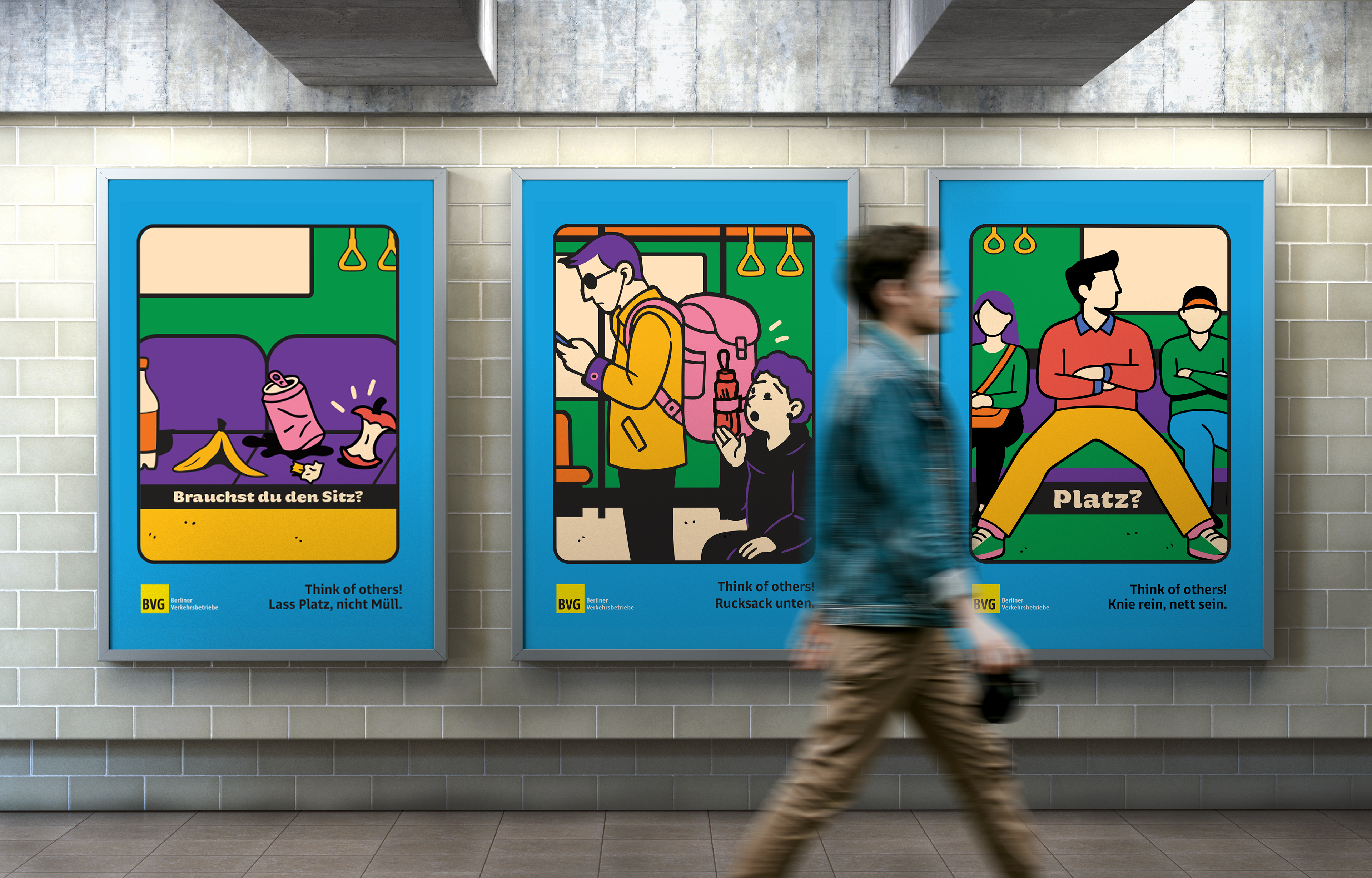
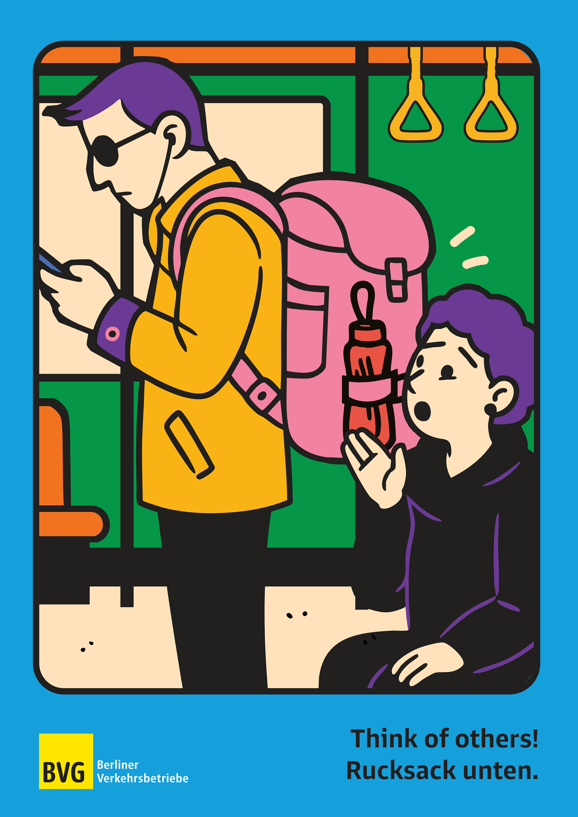
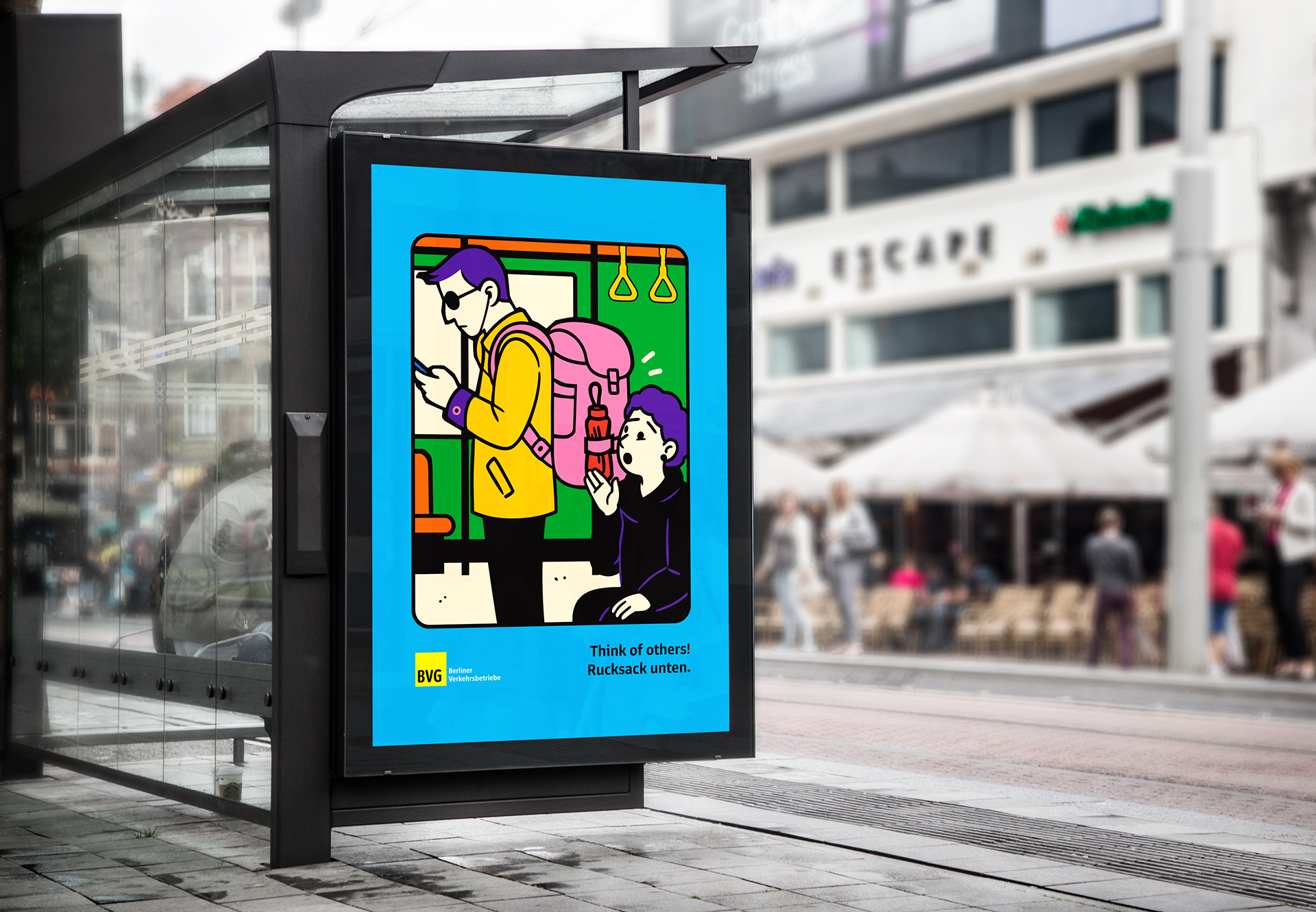
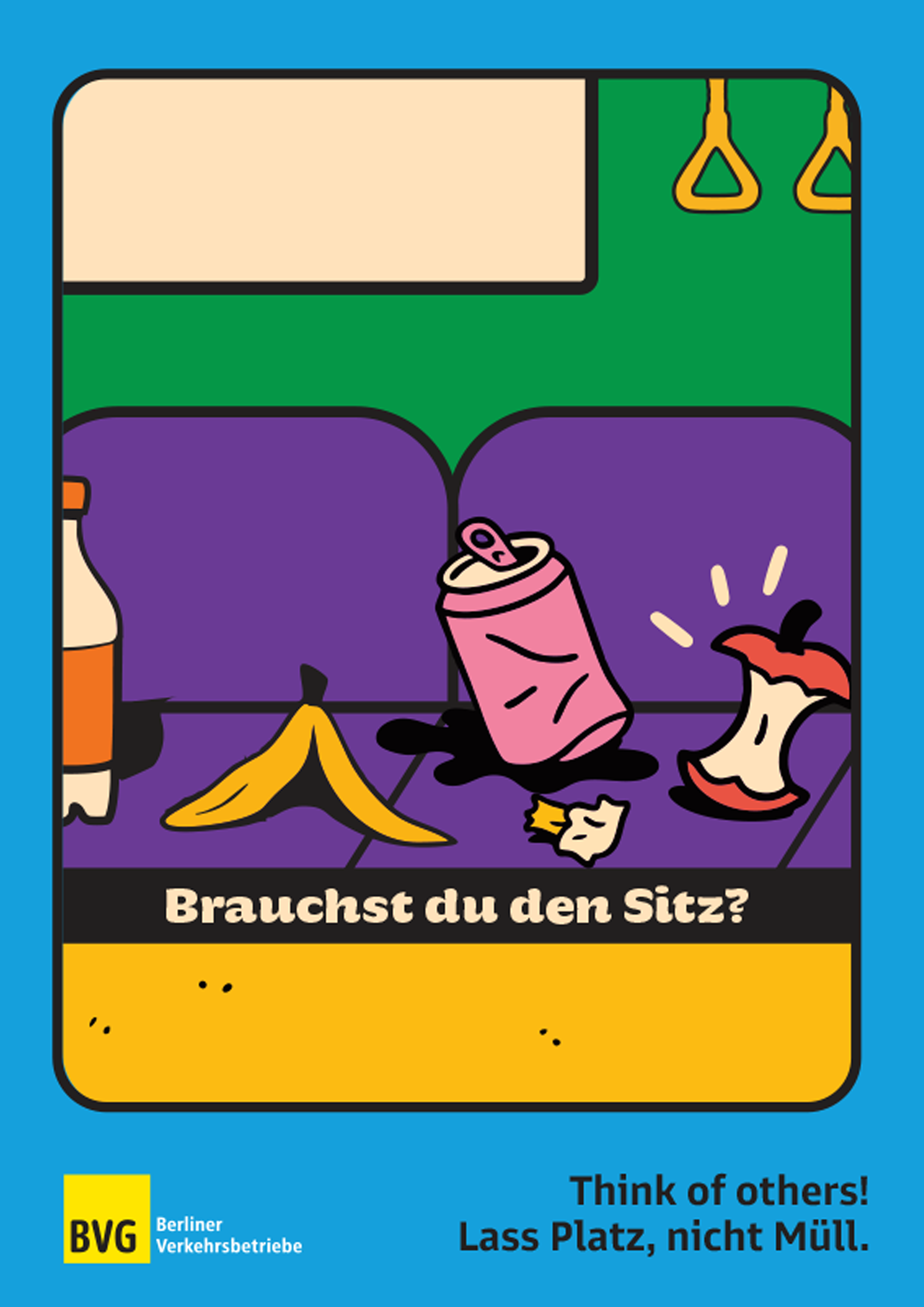
Three posters launch the series, each focused on a single everyday behavior: leaving trash on seats, blocking space with a backpack, and taking up more than one seat. Together they introduce the system’s tone in a bold, humorous, and direct way, and set a foundation for expanding the series with new situations.
Further themes in the series include escalator blockage, backpacks occupying a seat in rush hour, leaving and entering the train, giving up a seat, and moving inside the carriage to fill empty space.